When the startup folded, design didn’t
Client
Brightsteps AI
Role
UX Designer
Platform
Website
Industry
Parenting
Services
Research and Strategy, Design and Prototype
Highlights
01 - Highlight
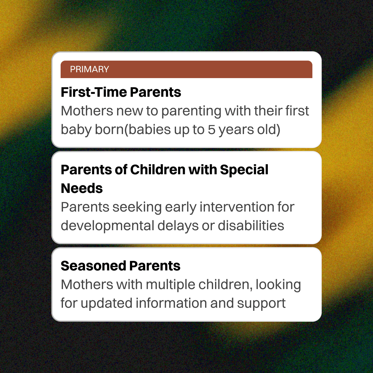
Defining the target audience
In an early conversation, I asked the founder if we should broaden the target audience beyond first-time moms to include babysitters or parents of differently-abled children. He clarified that skewing the message towards one specific group might alienate others. We agreed that the product should support all parents, but the messaging needed to remain broadly inclusive.
It was a key moment where I shifted focus to the fact that not all paying customers are necessarily the primary users.
02 - Highlight
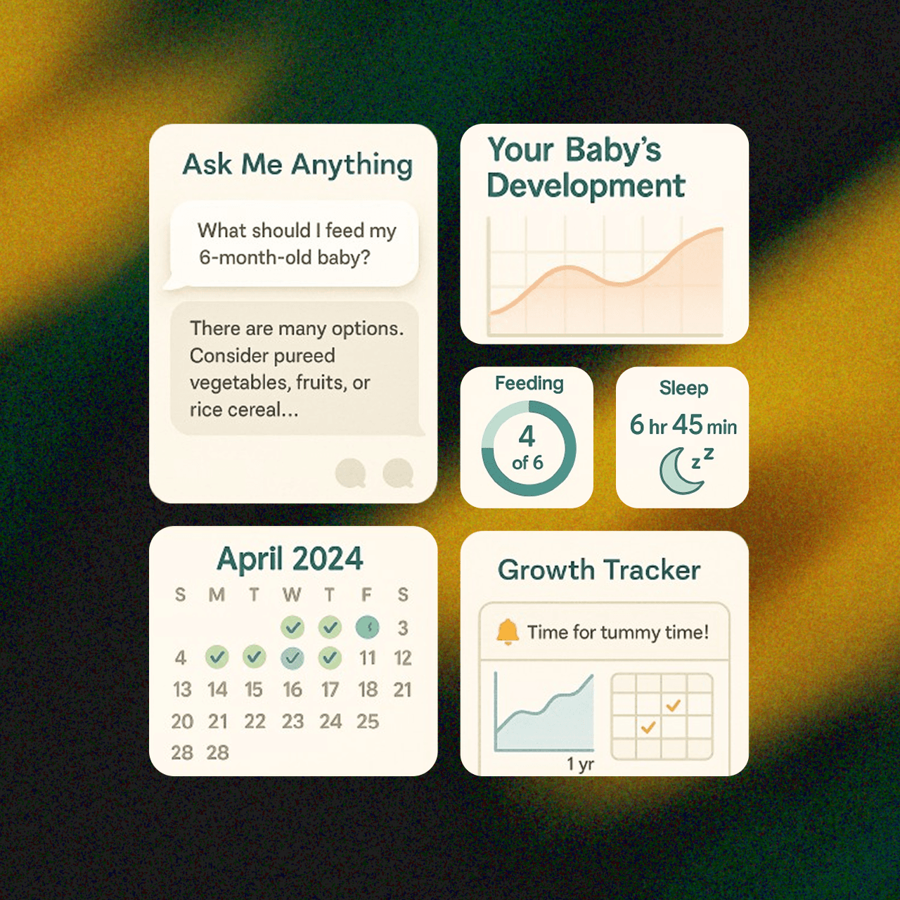
No screenshots from real-time apps
I wasn't allowed to use any images of UI widgets or components directly from existing products in the market, due to potential legal implications.
Hence, I studied two closely related apps and generated widget images through Recraft.
03 - Highlight
Tech constraint in Framer
I prototyped the site on Framer with sticky scroll animations. Since Framer didn’t provide access to code and the client was coding it manually, some animations were hard to replicate. From low-fidelity to v1, the site felt visually upgraded, but the client wanted to retain its simplicity.
We removed complex animations, replaced background visuals with a subtle fill and that indeed helped focus better on the message.
Why a promising idea didn’t cut through the noise
Context
Brightsteps AI is an early-stage startup, based in the San Francisco Bay Area. It majorly focused on building a personalized parenting assistant, powered by generative AI.
The founder, Viman, envisioned an AI tool that could support new parents with contextual advice and growth tracking.
I was brought in to validate early use cases and design a compelling landing page that could convert visitors into early adopters.

Problem
Despite a promising idea, the website wasn’t clearly communicating its unique value to overwhelmed first-time parents. It lacked structure and emotional clarity, which made it hard to convert.
Though the web app was functional, it had no paying users yet, just some testers from the founder’s closest network.
Viman needed a well-defined strategy to stand out in the crowded AI market.
Building curiosity
Goal
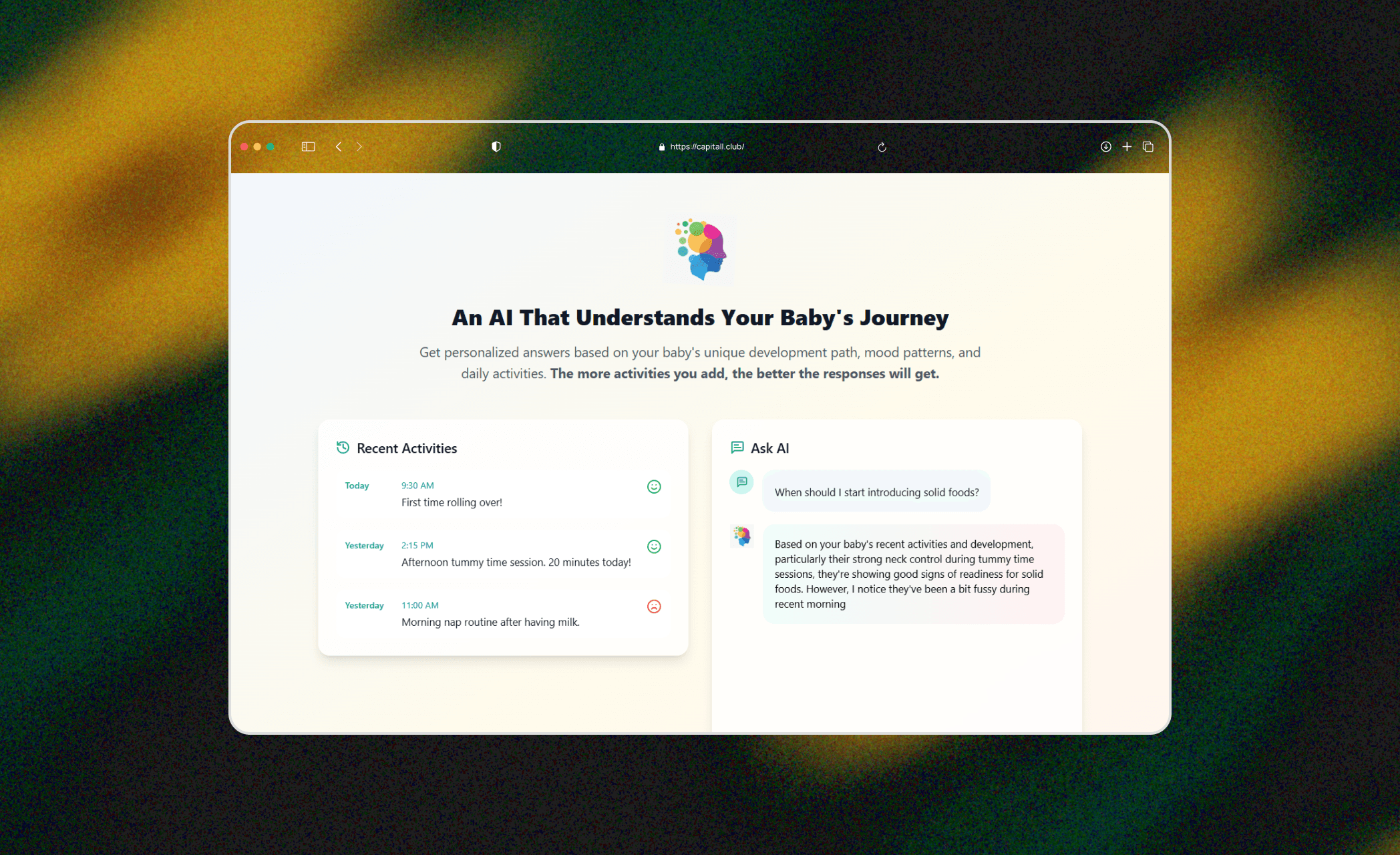
The platform aimed to reduce the overwhelm that came from endless Google searches and unrealistic benchmarks online.
At its core, the app promised a non-judgmental space where parents could get empathetic yet realistic answers. From a UX standpoint, we agreed to clearly communicate this use case. On the business forefront, the goal was to boost conversion by targeting the third touchpoint in the customer acquisition journey - 'Interest Development’.
If the landing page could gain their trust and curiosity, the rest would follow.
The ask was clear - Figure out why the current site was not working, design a well-structured prototype and improve the UI copy.


Process
It all started with a message on my LinkedIn Services page. Viman, the founder, reached out with a short note
I found your Service Page and I am interested in working together. Please review my project request and submit a proposal if it’s a good fit for you. Looking forward to learning more about your work.
He’d seen my work online and wanted to know if we could collaborate. I sent over a proposal with additional help on CMS updates.
Within hours, he booked a call via Calendly. Curious about how my previous work performed, he asked and I shared the impact. Three days later, we sealed and moved to Slack.
My role was end-to-end, from research to prototype. Viman handled development, all by himself.
The first thing I did was dive into the product. They gave me access to the app and understanding it from the user’s point of view changed my approach. I started by mapping the mental load of primary users. I also studied other parenting apps and AI assisstants, what worked and where they were falling short.
Then, I performed heuristic evaluation of the current website, which revealed gaps in information hierarchy. Once I had a clear direction, I proposed a site structure of 11 sections. After a brief review, It got approved.
Shortly after, Sreya Ganguly, Chief Marketing Officer, came on board.
Questioning brand positioning
Feedback and Tradeoffs
In our second meeting, I raised two concerns.
First, the app offered only a 7-day trial, which in my opinion, limited the no. of returning users while a freemium model will help in retention and acquisition of more customers.
Second, given its limited functionality except for a few unique features, the pricing might feel steep for early adopters.
Viman acknowledged the concerns but deferred decisions until after the first draft.
I also pointed out that dominant use of extreme blue felt too corporate and detached. I proposed warmer tones that felt more inclusive, avoiding gender biased cues but keeping it friendly and accessible.
The client initially leaned toward teal and we explored options until we found a balance.
Iteration
The final prototype was responsive and adaptive across varying devices.
The layout followed a narrative arc. It opened with a hero section that featured a less intimidating CTA. As users scrolled, they would encounter a section that empathized with their pain points, explained why and how Brightsteps could help. This was followed by a relatable breakdown of how it differed from generic AI and traditional parenting apps.
Repurposing the deliverables

Result
A week later, I received a message:
Hi Pooja, I wanted to share with you that after a lot of deliberation, we have taken the difficult decision to shut down the app.
Following were the top reasons:
Our early market research showed that the core user journeys will be very difficult to execute on. We will not be able to collect enough activity data to differentiate from ChatGPT. This may not be solving a clear pain point the way we originally imagined.
It might be a good-to-have tool which requires intense marketing to continuously sell. Those are not the fundamentals on which we want to build a company.
I am happy to complete the remainder of your payment, but no additional work is needed.
I didn’t want to let the work fade. I compiled it into a case study deck and launched it for free on Gumroad.
I also adapted the prototype into a Framer template and submitted for review.
Animation tradeoffs for quick development
Replaced sticky scroll animations with basic motion for website launch in a week's time
Better converting UI copy
Rewrote the UI copy in simple language to avoid jargon and better resonate with users
1st digital product shipped
Turned the deck into a free Gumroad resource, creating lasting value beyond the brand
Widget preview without copyright
Generated AI images for widgets from traditional apps using Recraft
What this short project taught me long-term
Learning
The brand shutdown in a week's time and I learnt that it doesn't end there.
Reusing it was my hope of multiplying the revenue and the deck happened to be my first digital product on Gumroad.
Also, during our first brief, I understood that for key stakeholders, business metrics were top priority. Talking in business language makes it so much easier to seal deals.
Timezones were a bit wild, but the client was extremely involved and dedicated.
Future Scope
Extensive research with added functionalities can bring back the app for next gen parents.
Expanding into B2B segments like nursery teachers and caregivers can create new revenue channels.
Freemium model could drive scalable adoption. Designing for daily mobile use will further improve engagement and conversion.